Post by duckman on Jan 8, 2009 5:20:11 GMT -8
www.americanthinker.com/blog/2009/01/global_warmmongering_more_silk.html
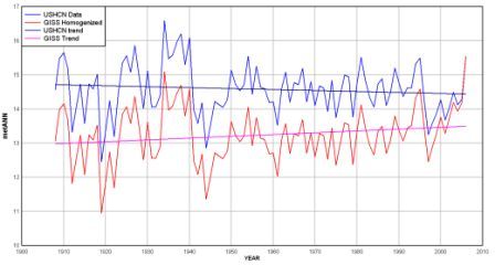
It seems that NASA's James Hansen, head of the Goddard Institute for Space Studies (GISS), is at it again. He just can't let the data speak for itself. In yet another egregious display of Anthropogenic Global Warming (AGW) arrogance, he changed the temperature data from 1910-2008 to reflect what is clearly a cooling trend to reflect a warming trend. (Y-axis = Annual Mean Temperatures in centigrade; X-axis = Year)

These are the USHCN (United States Historical Climatology Network) "raw" and "homogenized" data plots from the GISTEMP (GISS Surface Temperature) website synthesized into one chart with polynomial fit trend lines. As seen in this comparison chart, the Blue Lines represent raw data -- clearly indicating a cooling trend. Whereas the Red Lines are the adjusted trends after subjected to Hansen's own curiously compensating algorithm. Junk in = Junk out.
Indeed this past year (2008) is set to be the coolest since 2000, according to a preliminary estimate of global average temperature that is due to be released this month by the Met Office's Hadley Centre in Great Britain. The global average for 2008 should come in close to 14.3C, which is 0.14C below the average temperature for 2001-07.
Nevertheless, global warming partisans at the Met and elsewhere have taken to assuring everyone that cool temperatures are "absolutely not" evidence that global warming is on the wane. Yet those warning and cautionary adamancies are always absent when it comes to linking heat waves to global warming. "Curiouser and curiouser," said Lewis Carroll.
Just one more reason Hansen should NOT be employed at NASA.
His motto is "If you can't make the future hotter, make the past colder"
It seems that NASA's James Hansen, head of the Goddard Institute for Space Studies (GISS), is at it again. He just can't let the data speak for itself. In yet another egregious display of Anthropogenic Global Warming (AGW) arrogance, he changed the temperature data from 1910-2008 to reflect what is clearly a cooling trend to reflect a warming trend. (Y-axis = Annual Mean Temperatures in centigrade; X-axis = Year)

These are the USHCN (United States Historical Climatology Network) "raw" and "homogenized" data plots from the GISTEMP (GISS Surface Temperature) website synthesized into one chart with polynomial fit trend lines. As seen in this comparison chart, the Blue Lines represent raw data -- clearly indicating a cooling trend. Whereas the Red Lines are the adjusted trends after subjected to Hansen's own curiously compensating algorithm. Junk in = Junk out.
Indeed this past year (2008) is set to be the coolest since 2000, according to a preliminary estimate of global average temperature that is due to be released this month by the Met Office's Hadley Centre in Great Britain. The global average for 2008 should come in close to 14.3C, which is 0.14C below the average temperature for 2001-07.
Nevertheless, global warming partisans at the Met and elsewhere have taken to assuring everyone that cool temperatures are "absolutely not" evidence that global warming is on the wane. Yet those warning and cautionary adamancies are always absent when it comes to linking heat waves to global warming. "Curiouser and curiouser," said Lewis Carroll.
Just one more reason Hansen should NOT be employed at NASA.
His motto is "If you can't make the future hotter, make the past colder"

